The Beginning
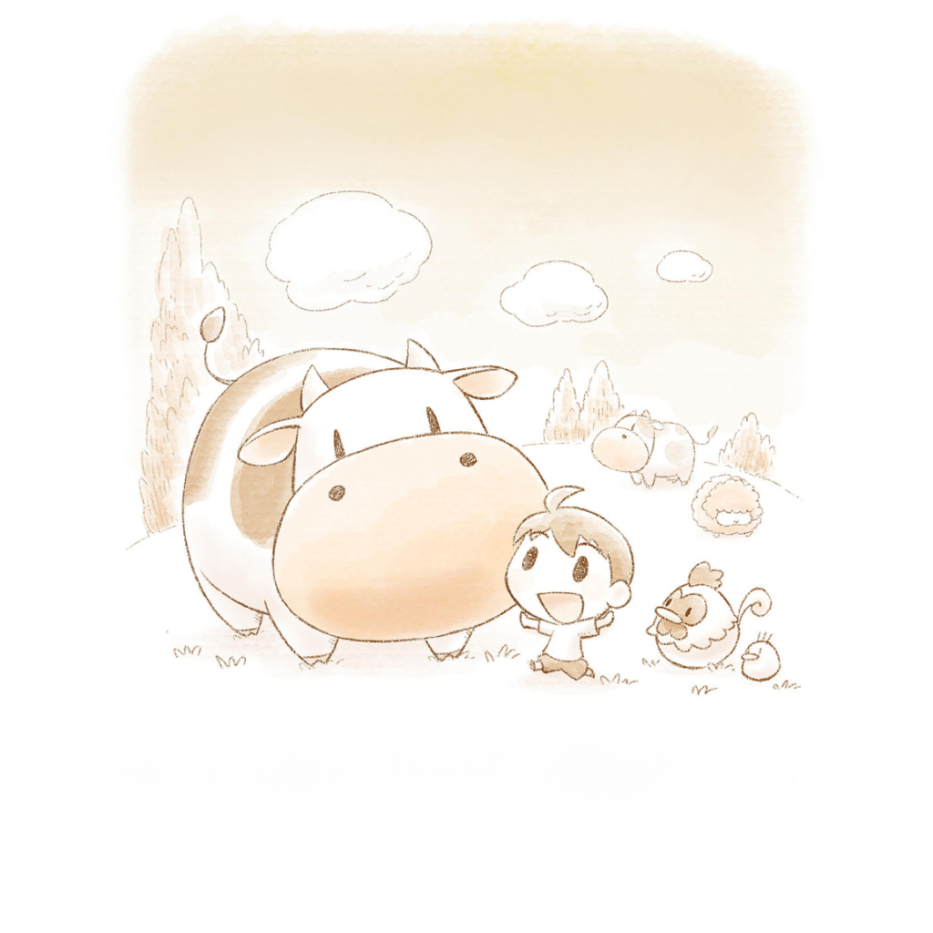
Story of Seasons is my favorite RPG farming simulator franchise of all time. During my fan-searching, I discovered a bilingual short story detailing the game’s origin story, written and illustrated by the reputable character artist, Matsuyama Igusa. Originally published in Japanese, this short story pays homage to over 20 years of Igusa’s contributions to the franchise’s distinctive art style. For fans like myself, it encapsulates all the wonderful elements of the game’s history in one beautiful piece of work.
Watch the demo below to see the current layout of the short story (there is no audio).
Copyright Disclaimer: under section 107 of the Copyright Act of 1976, allowance is made for “fair use” for purposes such as criticism, comment, news reporting, teaching, scholarship, education, and research. This project is a proof-of-concept, and as such does not represent nor infringe on the creator(s) in any way.
Challenges with the current layout
- Endless scrolling
- Hard to tell where each page starts and begins, as well as which English text goes with which page.
- Images with text are not localized into english
- Bilingual format is fine but reading experience can be improved as a monolingual piece
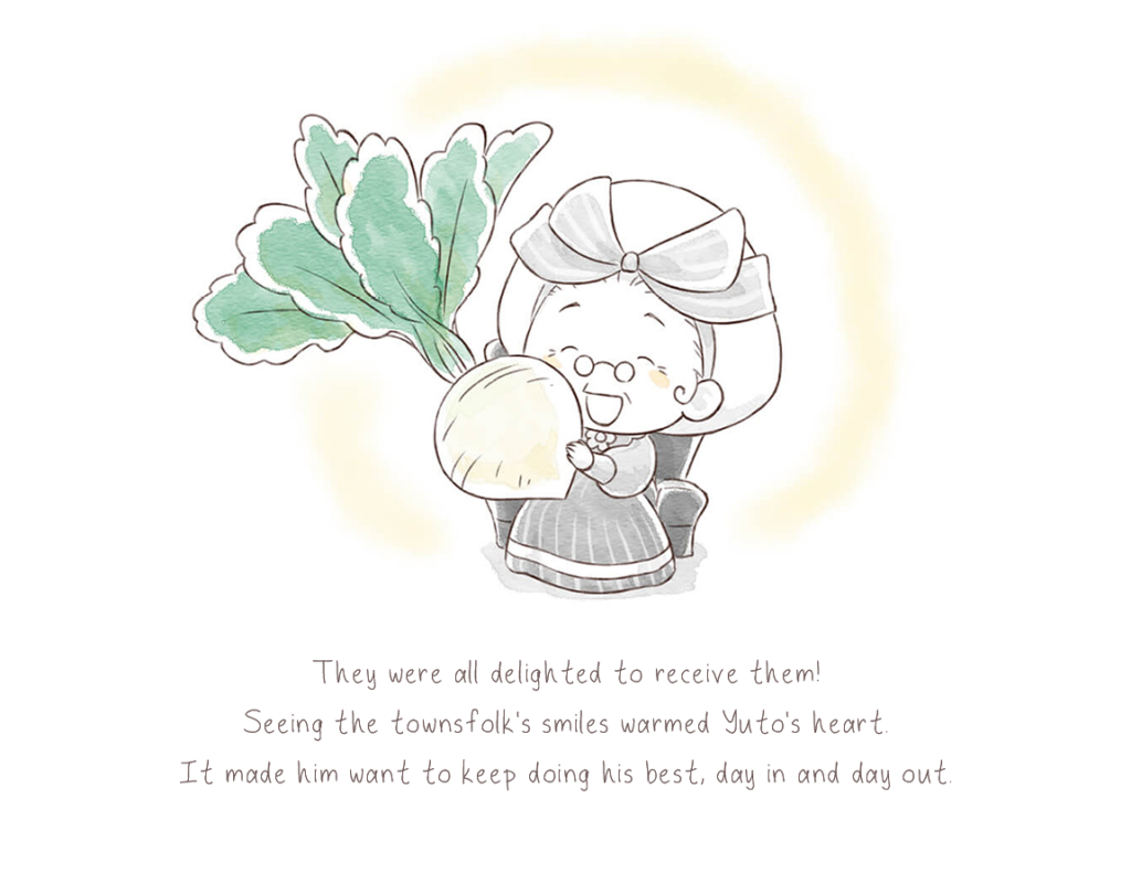
Given these challenges, I will walk you through my process of converting 72 vertically displayed PNG images into a seamless English EPUB for better localization aimed at an English-speaking audience. From creating personalized fonts to localizing images, each step is designed to enhance the reading experience, ensuring it captures the same magical and nostalgic essence as the original Japanese text.
The Middle
Workflow Overview
Create new replacement fonts
Create background overlays for each page
Assemble the epub with editable text layers
Translate
Integrate epub with all English assets
Perform flat-image localization
Integrate epub with localized images
Software Used
Calligraphr & Adobe Fresco
Adobe Photoshop
Adobe InDesign
Phrase TMS
Adobe InDesign
Adobe Photoshop
Adobe InDesign
Creating New Replacements Fonts
1st Main Challenge Presented:
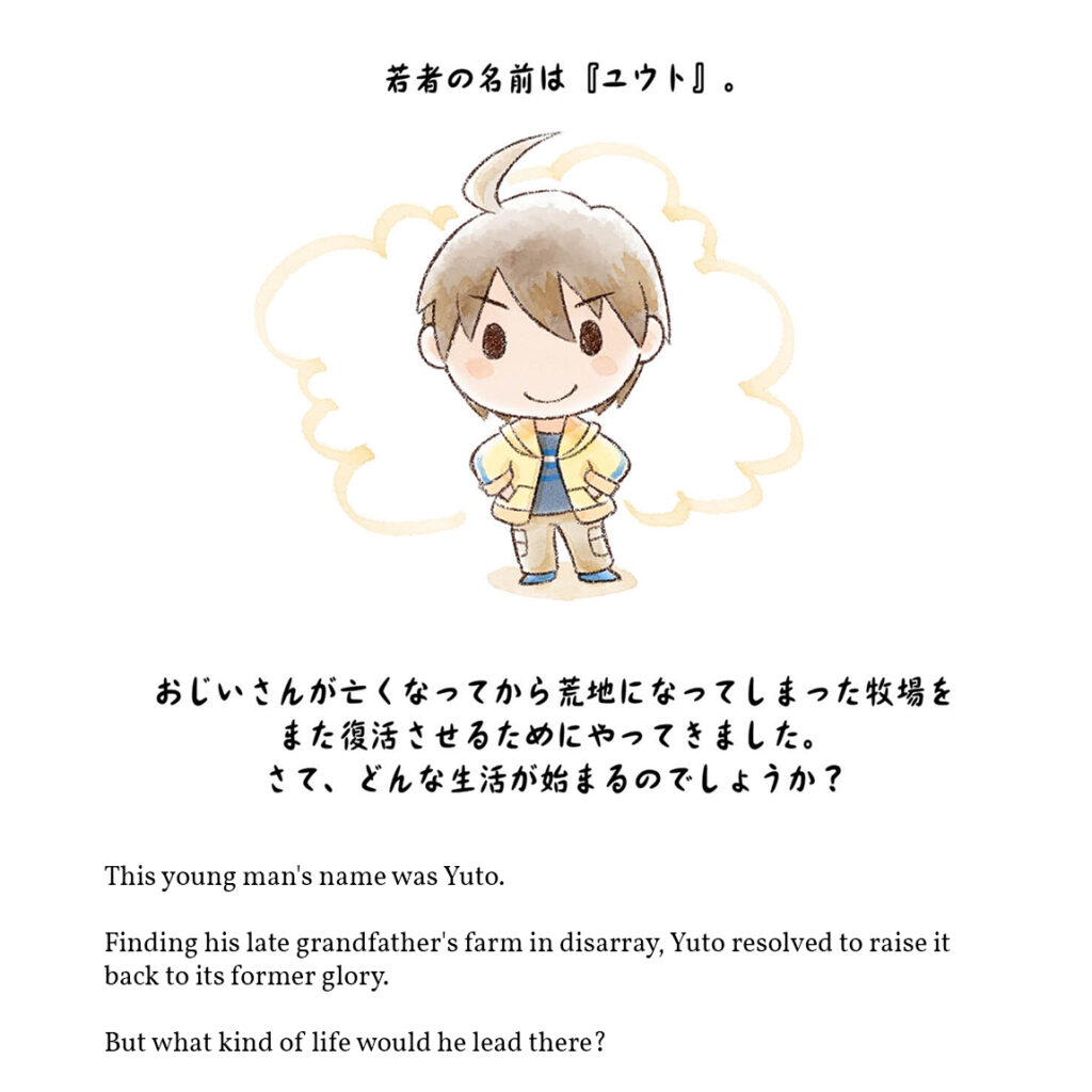
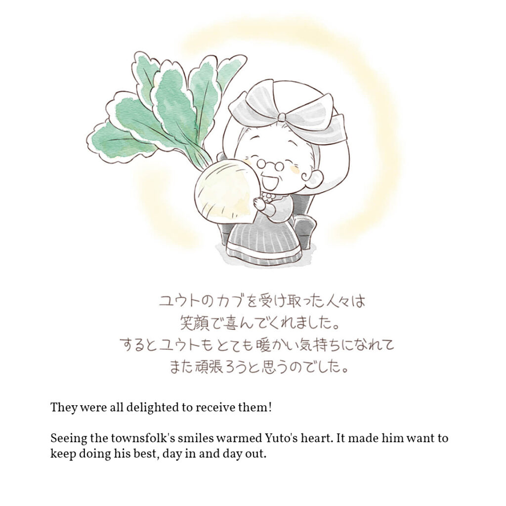
Below are 2 page samples that show the fonts used in the original Japanese version; one font with a bold-smooth style and another with a light-handwritten-pen style. The English translations are simply provided in a standard font on the bottom of every page throughout the entire short story. So how can this be elevated?
My proposed solution:
Create new fonts that match the Japanese styles for the English version.
For this process, I used Adobe Fresco and Calligraphr to create 2 new fonts. In keeping with the theme of the game, I named these fonts “Harvest” and “Sprites”. Check them out in-context below.
Adobe Fresco offers a wide range of different ink tools which allowed me to be able to easily mimic the style of the Japanese. Here are the settings I used for both fonts that I made.
If you would like to download the fonts I created and use them in your own applications, here are the downloadable files you can access.
Flat-Image Localization
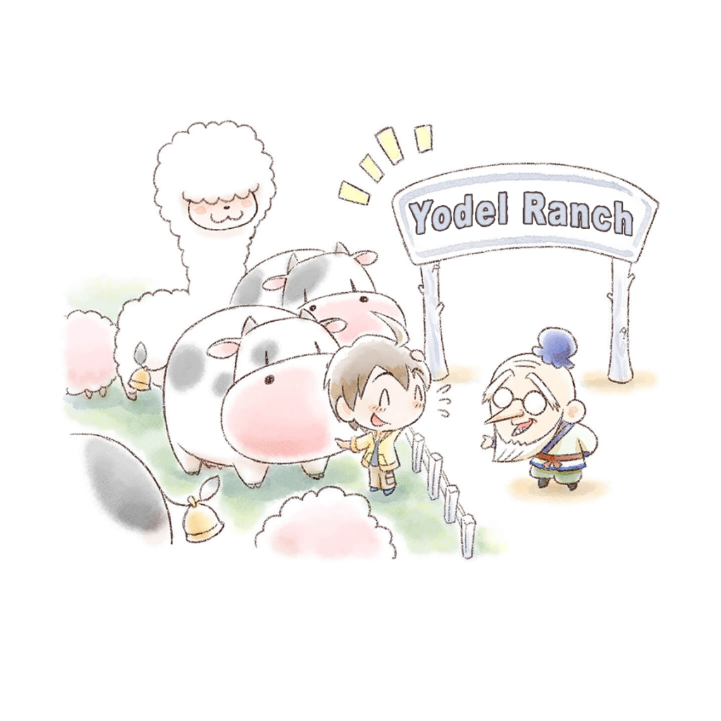
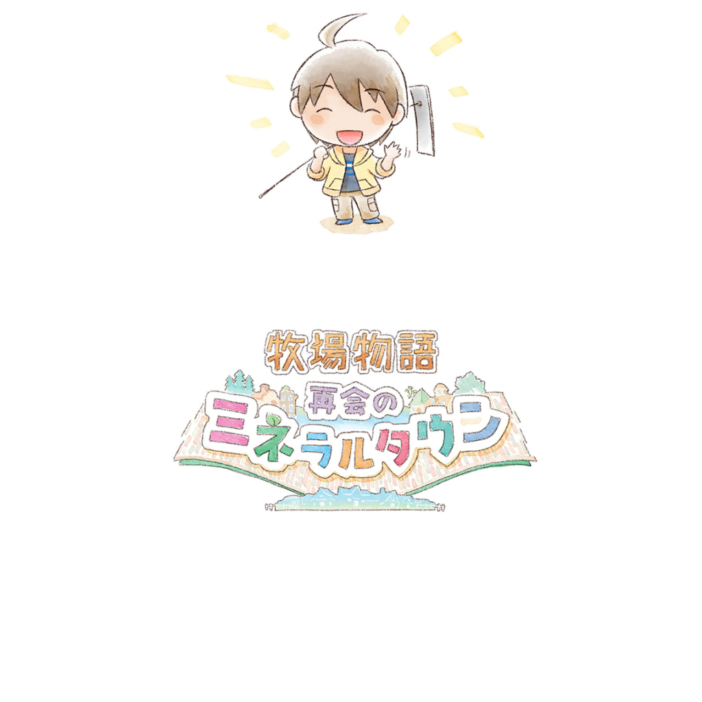
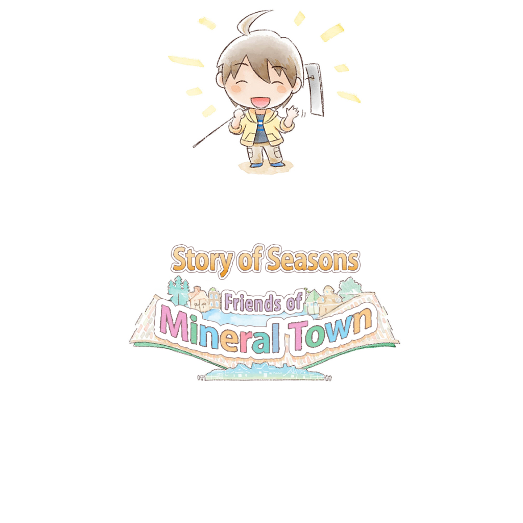
2nd Main Challenge Presented: Embedded images with text
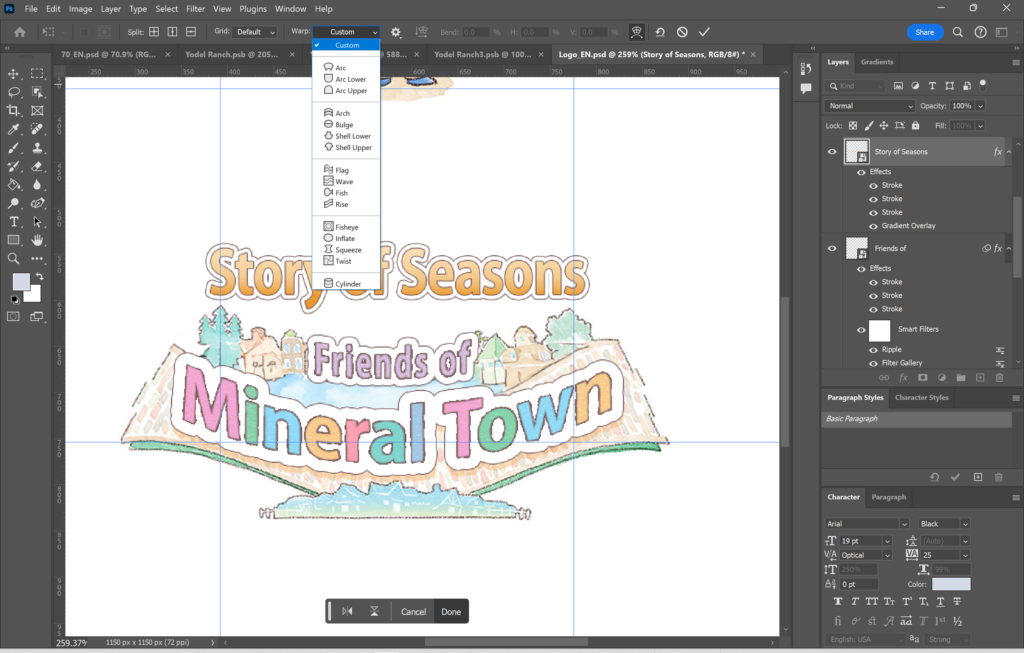
2 out of the 72 pages in the short story needed some additional work to be done in Photoshop to completely localize. This turned out to be the most time-consuming part of the process as it required learning some features of Photoshop I was not familiar with before. After experimenting with different settings, I came up with a solution to apply a similar watercolor effect that you can see in the original Japanese version as well as the outline around each character/letter.
My proposed solutions:
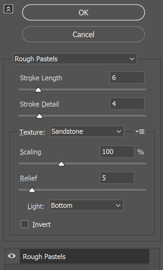
1. Create the ‘watercolor’ effect: Filter > Filter Gallery > Artistic > Rough Pastels
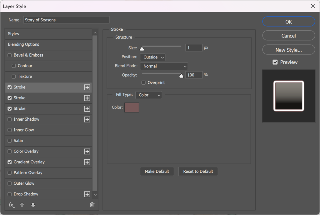
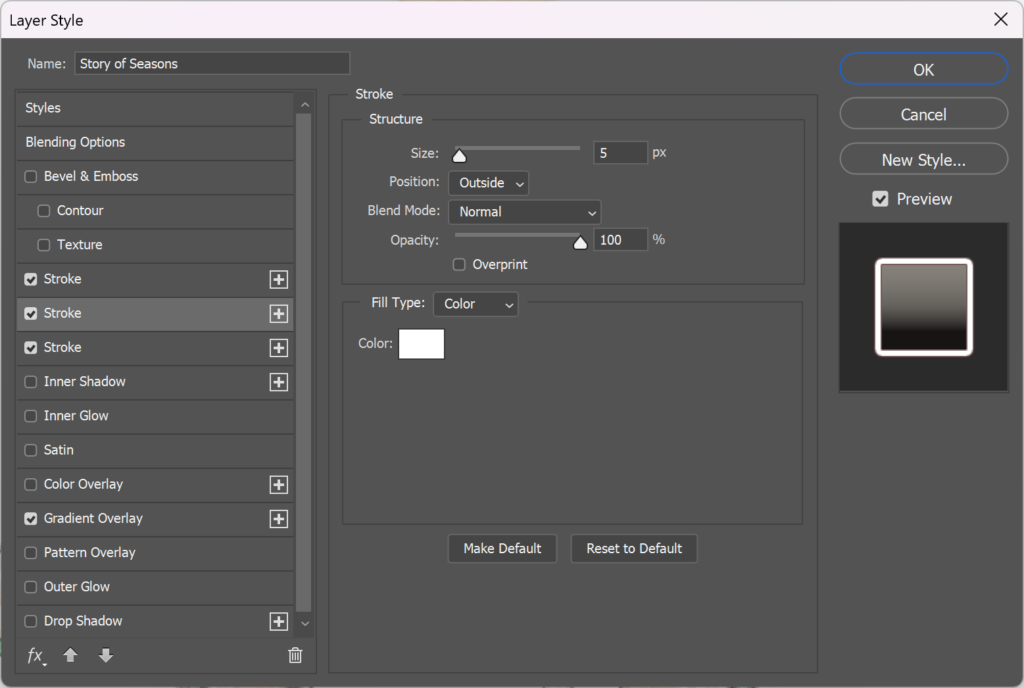
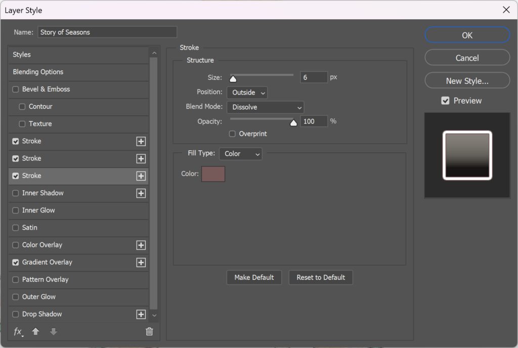
2. Create the outline effect around the letters: Layer Style > Stroke
Apply 3 layers of strokes to create the multiple outlines around the letters for “Story of Season Friends of Mineral Town”
The “Yodel Ranch” text only needed the first stroke layer.
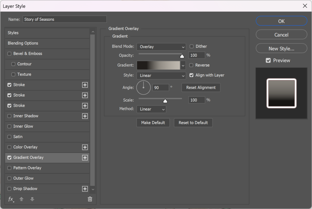
3. Create the gradient effect: Layer Style > Gradient Overlay
Only the “Story of Seasons” text needed this effect.
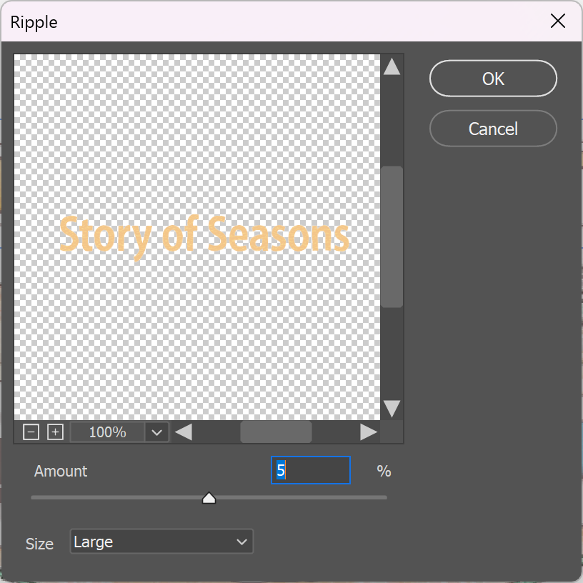
4. Create a layer of distortion: Filter > Distort > Ripple
5. To create a wave effect: Transform Text > Add Warp
The End
Assembling the EPUB
Since the translations were already provided, I simply extracted the text and copied it over in Phrase during the translation step, saving the time I would have spent manually translating the project. While I didn’t have to, I recreated this process in my workflow to ensure that translation memories and term bases could still be utilized for other related projects. Additionally, doing the file prep and creating the editable layers in InDesign is best practice for localization so that it could be imported into any CAT Tool of choice, translated into any language, and then exported again to view the full integration take place, which is much more efficient than copying and pasting segment by segment from a picture list. The background overlays I had edited for the English assets were also very simple to construct, as most of the text could be covered using a white fill in Adobe Photoshop.
Once I had the fonts prepared, the background overlays created, and the editable text layers set up in Adobe InDesign, everything came together nicely and smoothly during the final integration step.
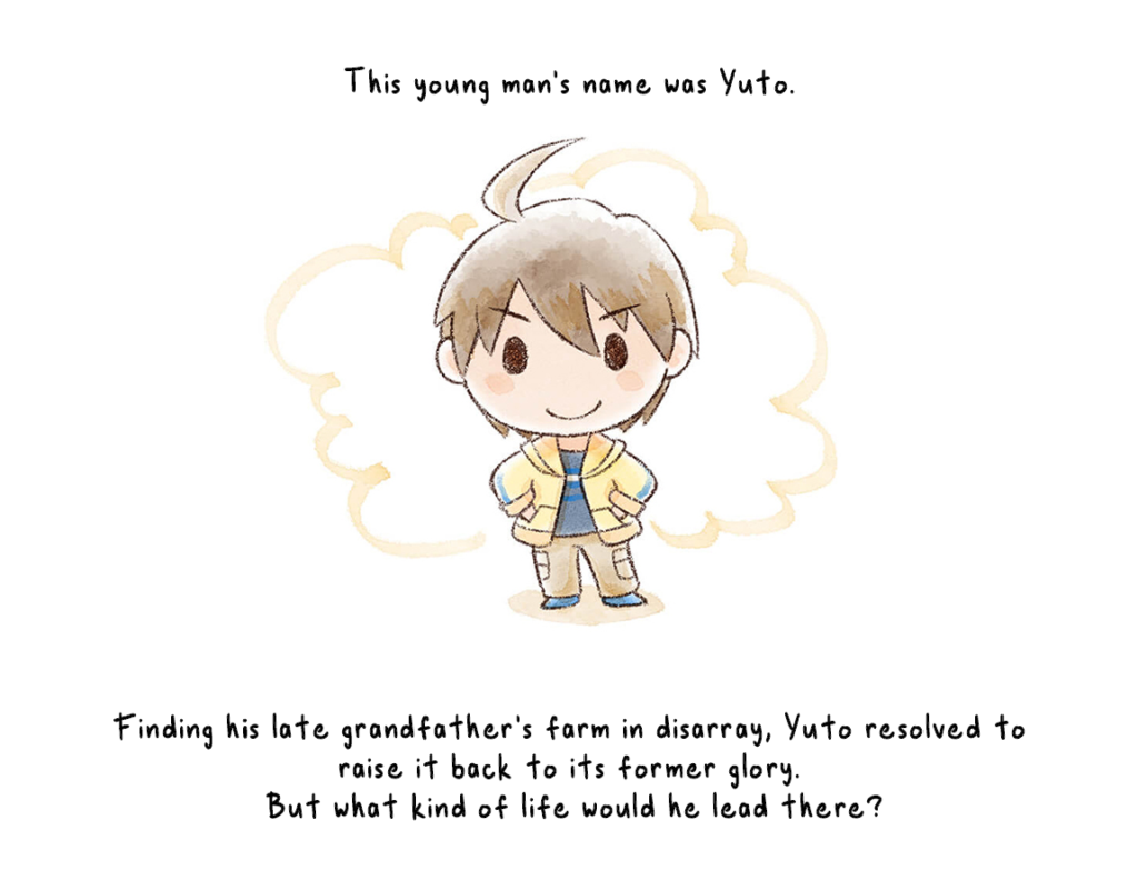
This is what the short story looks like after piecing everything together! You can watch the full 10-minute video at your leisure, or access the EPUB version and read at your own pace.
Reflections
Throughout this process, I learned to incorporate various DTP skills valuable in the localization industry, such as creating personalized fonts, developing background overlays, and assembling EPUB files with editable text layers. While I became more efficient with these skills, I also realized there are many other techniques I can practice saving even more time in the future. Despite spending considerable effort on localizing the images alone, there were artistic elements, like the intricate leaf motifs and shading/filling of color, that I couldn’t fully incorporate. This highlights an area for further exploration and advancement in my skills. Additionally, the challenge of finding compatible fonts for both Japanese and English is always a factor when localizing between these two locales, given their completely different writing forms. However, I was pleased to discover that I could recreate some visual elements using Adobe Fresco, which produced satisfactory results in maintaining the original style. Overall, this project not only allowed me to apply and refine my DTP skills but also provided valuable insights into areas for future improvement.